


I decided to challenge myself for this (upcoming) animation, and Not design in my typical dependency on gradients, grainy, and moody colors. In fact, upon reflection, I think this is my anti-style of design: bright colors and a flat 2D look. I have struggled, mind you, Struggled to make the design up to my standards, and the foundation stage has taken wayyyy longer than it normally has.
Today I am being brave and showing the world the roughest of rough style frames. These were created during the ‘what am I doing’ stage that have eventually rounded itself out to an acceptable design.
why the first idea is normally never the best idea
boom: first idea for a typographic style frame with the phrase ‘everyone you know.’ The concept is to emulate the phrase through supporting imagery, where you, the dot, is connected to ‘everyone’ through lines that are attached to said dot.
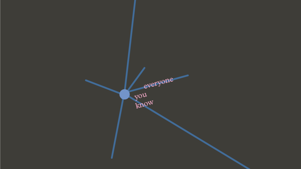
I’m looking at this now as I write and it is NOT it. Being harsh- it’s ugly (don’t come after me): why are we trying to put pink text overtop of a blue line AND black background. The text is half-committed to the line. Also, the pink really does not work with the blue for a ‘cut through’ moment.
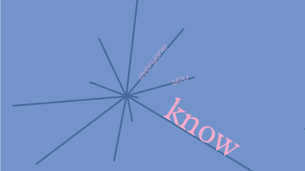
getting somewhere with the concept… text is still placed weird on the page.
ok! Making the lines create an implied circle is good design choice. Typography and text placement feels better. But now, the two concepts feel disjointed and not connected.
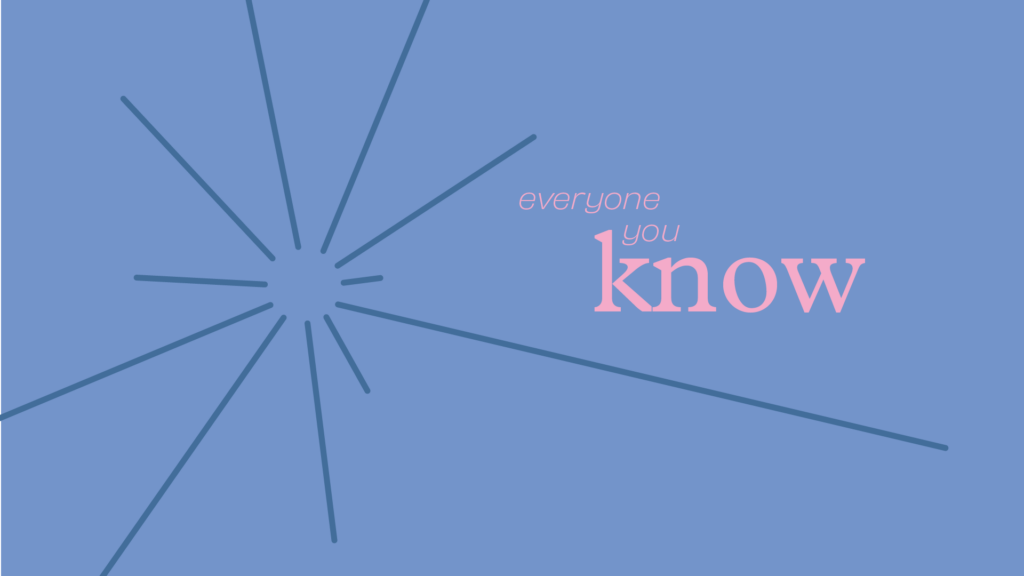
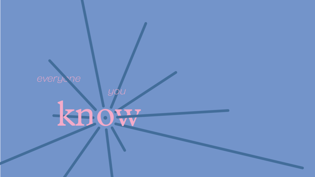
this feels like the right track. Type and design concept feel connected, feelin solid. What if I pushed it a bit more?
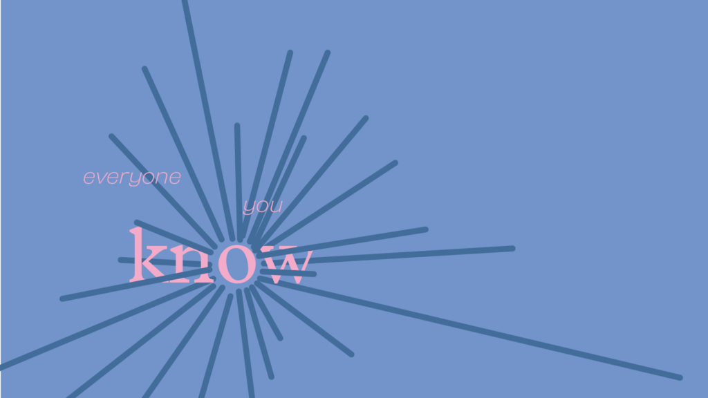
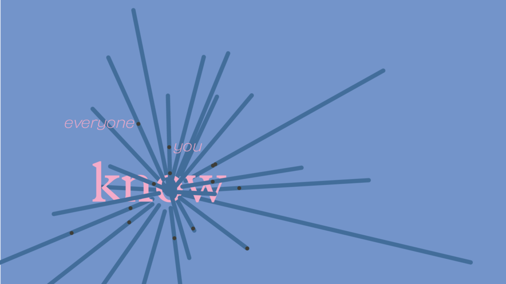
hmmm. Now feeling there’s a bit too much going on… harder to easily glean the type.
and the winner is
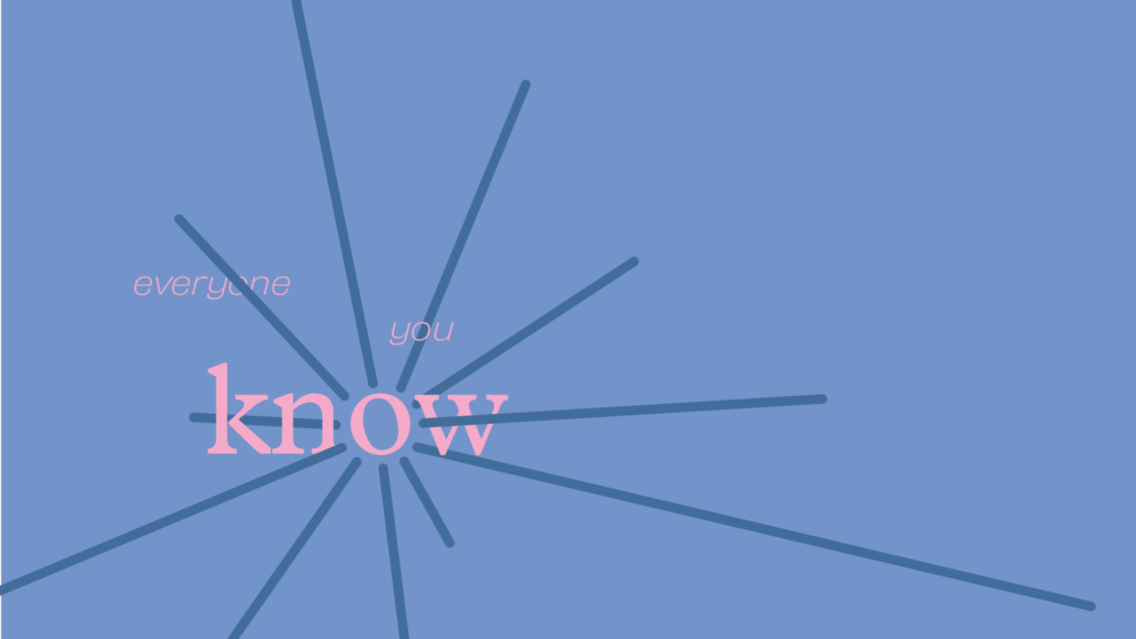
Sometimes simple is better. In this case, it was. I ended up taking the dot out in the middle of the o since it just cluttered up the space- gotta let it breathe as it already had 3 ovals going on (1: made by the lines, 2: the outer rim of the o, 3: the inner part of the o).
translating storyboard squiggles into something usable
I am not the best storyboarder. In fact, probably far from it as my working style leans more into me feeling the motion first and scribbling something down to best capture it. case in point:
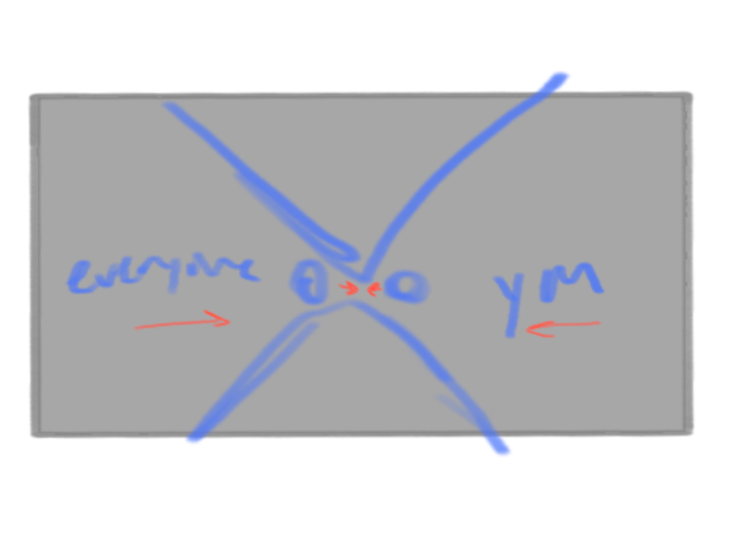
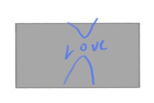
If I didn’t explain this, you’d probably have no idea what this means.
Anyways: the triangle to dot is an abstract representation of a person. The line here to convey is ‘everyone you love,’ so in my head I came up with a two-parter: ‘everyone you’ would come together to create ‘love.’ The red lines indicate the motion inward!
translating time
Since I already have a solid concept, this is a matter of refining this style frame.
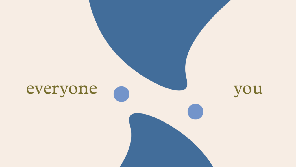
While I like where everything generally is, the motion planned for the dots currently feels cramped/doesn’t have enough space to swing back.
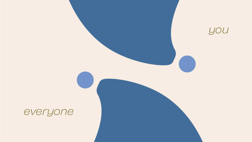
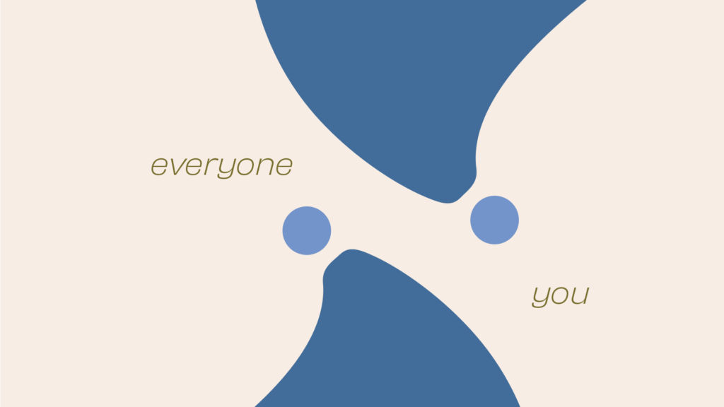
This was a matter of how far I could push the concept- me fiddling around with the triangle shape to make it more interconnected with the ‘head’, but I found the abstract version to work better.

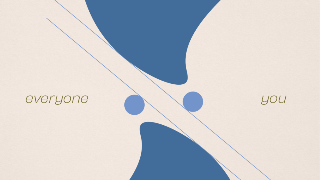
Circles are too big here- especially as they couldn’t be bigger than the circle for love in the following frame. Tried playing around with an equal balance of space between the two sides, but it just didn’t align properly without the heads being too disconnected from the body.
final style frame!

Landed on a similar rendition of the first style frame I cooked up for this concept, but switched the typography out for the lighter typeface, as for emphasis, love would be the heavier serif. With this chosen type, the sense of planned motion doesn’t feel as cramped anymore.
now in motion…
Overall, I definitely figured out that designing style frames is a muscle- that for me still needs to be worked on. I found that it’s way easier to design with a solid concept, but fiddling and figuring it out still produces solid work!
This style of design has definitely been a challenge, but that is the way of growing pains. I’ll see you in another rendition of motion talks!

Leave a Reply