

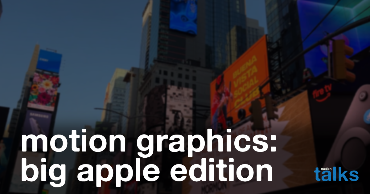
hello! I went to NYC for the first time! Journey along with me through my take of motion graphics in the big apple: what motion graphics looks like in a city that always wants your attention. (Spoiler alert: things are moving)
Typography woooooo
Moving type is THE number one mover in ads. Makes sense to be the top favorite, as typography easily integrates copy/words to entice and motion (moving thing to grab your attention so you can hopefully read). Tends to be super simple so it’s not flashy and too off-putting.
The most common typography motion I saw was a rise (text rising from bottom to top). There were a couple other honorable mentions of a slide (text moving in right to left), but the rise seems to be the most popular.
The most expressive typography was Pepsi with stretch and fall (text stretched vertically as it moved downward).
Honorable mention goes to NWSL for a smear (text letters became stretched horizontally as it moved downwards off screen). Honorable why? The text isn’t the focus of the animation, more like an added bonus.
something is Always Moving
Even in graphics that would be considered still, there was always a moving aspect to it. In a promo for The LADY (TV show), the actor took up 75% of the screen and acted as a still graphic. However, the subtly of the photographer on the left moving off frame creates continuous motion, and the obvious flashing from the ‘shutter’ grabs the attention of the viewer.
2D + 3D graphics all Day
The trend seems to be 3D graphics being the treatment for visuals (particularly product) and 2D being support for type and transition, specifically in Times Square. The reason why this could be is that billboards in NYTS is absurdly expensive, so bigger companies with more dough to spare can throw some away while other companies and ads (such as video ads for experiential (excluding broadway)) can’t.
Another thing is that Times Square is the prime example of the advertising lingo, ‘clutter.’ Too many things are already competing for your attention, so you have to create something that will stand out amongst the clutter for audience attention, which typically ends up creating more clutter. 3D products have more attention grabbing pieces to them, such as lighting, depth, life-likeness, compared to 2D (not to say that 2D can’t measure up with those exact components). 3D tends to fall in ‘look shiny look here,’ while 2D nowadays tends to lean for that more ‘human’ feel in the age of AI, but I digress.
Times Square definitely felt like the pinnacle of NYC’s mantra of a city that never sleeps, with screens always on and trying to grab your attention. Definitely the most interesting motion analysis of real-world examples I’ve had so far. Hope you enjoyed and I’ll see you again in another rendition of motion talks!

Leave a Reply